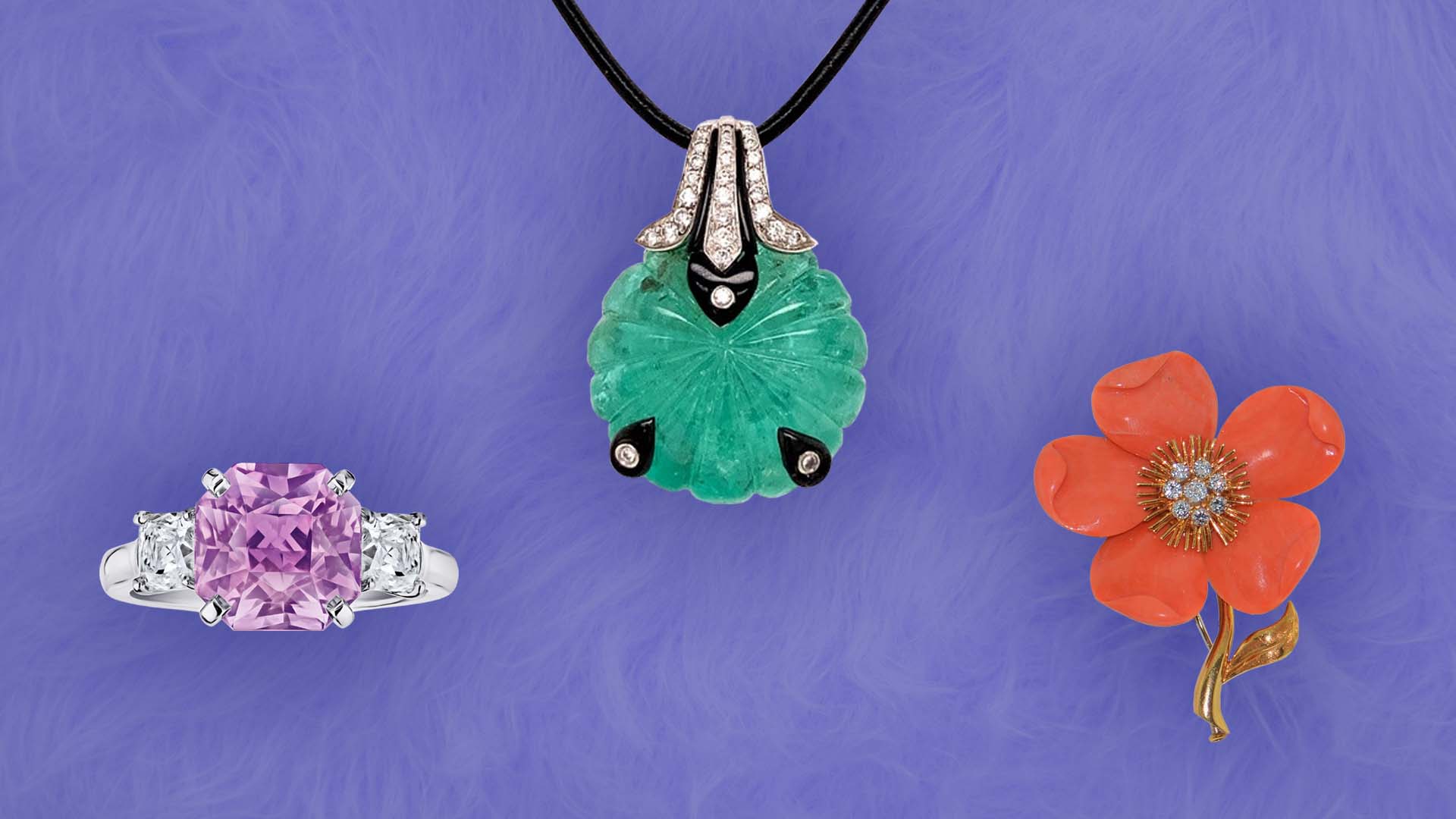
From Left to Right: Pink sapphire, diamond and platinum ring from David Gross; Antique carved emerald, diamond, black onyx and 18-karat white gold pendant from Rawat Gems LLC; Mediterranean coral, diamond and 18-karat gold flower brooch/pendant, signed Van Cleef & Arpels, from Spectra Fine Jewelry, all on a Very Peri background.
Color surrounds us. It’s everywhere we turn and everywhere we look. Color has the ability to influence our feelings – it excites us or calms us. Color is very personal, everybody sees color slightly differently, but its impact is profound. Color speaks a language of its own and we use it to communicate a variety of messages, often unconsciously.
Each year the Pantone Color Institute™ chooses a Color of the Year. The color experts analyze trends from across all industries that influence culture and society including but not limited to films in production, travelling art collections, travel destinations and socioeconomic conditions. They also consider new technologies, social media platforms and even sports events that are global in nature. It’s a way to gauge the mood of the world and the color that best reflects that vibe.
Brand New Color
This year, for the first time, Pantone created a color specifically for 2022. That color, Very Peri, is defined by Pantone as “a dynamic periwinkle blue hue with a vivifying violet-red undertone that blends the faithfulness and constancy of blue with the energy and excitement of red.”
“Encompassing the qualities of the blues, yet at the same time possessing a violet-red undertone, PANTONE 17-3938 Very Peri displays a spritely, joyous attitude and dynamic presence that encourages courageous creativity and imaginative expression,” explains Leatrice Eiseman, Executive Director of the Pantone Color Institute.
According to the Institute, Very Peri is a reflection of the transformative times in which we are living, it combines the digital world with our physical lives. So how does Very Peri translate to jewelry?
For the most part, we won’t find gems in nature the color of Very Peri, probably the closest we’ll get is with iolite or a pale tanzanite. That being said, it’s a color that is in some ways surprisingly neutral allowing it to gracefully harmonize and contrast with a number of other hues.
Think pink — tourmalines, pink sapphires and pink diamonds that is. Those three stones are quite lovely with Very Peri as is amethyst, which pulls out the violet tones of the hue.
Contrasting Colors
Very Peri is described by the Institute as “displaying a carefree confidence and daring curiosity that animates our creative spirit…” For those of us who are adventurous in how we wear color, pair Very Peri with green hues. It’s periwinkle tones complement these verdant shades. Emeralds will look especially good with Very Peri, but if you like neon tones and you want to amp up your look, vibrant peridot will also be a lovely choice with this lively color as is the lush green of tsavorite garnet. For an unexpected twist, wear Very Peri with coral or citrine. It will be a more muted approach to color pairing, but one that is solidly on trend.
A Neutral Palette
Looking to add a little pop to your outfit? Very Peri adds that burst of color that takes black, grays, browns and taupe tones to a whole new level of cool when paired with this new shade. Gold chain link necklaces or bracelets will be a great match for this more neutral color palette. You can also style Very Peri with platinum. The noble metal’s cool tones, are complemented by the blue hues of Very Peri, worn together, the two are a modern and sophisticated combination.
“The Pantone Color of the Year reflects what is taking place in our global culture, expressing what people are looking for that color can hope to answer.” Laurie Pressman, Vice President of the Pantone Color Institute said in a press release. “Creating a new color for the first time in the history of our Pantone Color of the Year educational color program reflects the global innovation and transformation taking place.”
Authored by Amber Michelle
